
Apnaklub
Apnaklub
App design • 2022
App design • 2022

The procurement problem
For kirana store owners, procurement continues to be an opaque process. Though current netwroks of supply are well established, they often have to deal with lack of transparency in pricing and delayed delivery timelines. On top of that, handling a brand’s distribution agent can often become an act in managing egos. This makes it hard for established businesses to operate efficiently and even harder for new entrants to create a foothold.
Apnaklub sought to solve this by giving kirana shop owners a platform where they could easily browse prices and place orders without the hassle of dealing with a brand’s distribution agent amongst addressing other inefficiencies.
Understanding the lay of the land
To begin with, the focus was to explore all the known and unknown aspects of this problem. Extensive conversations with the Apnaklub team helped me understand what they knew from their own on ground experience in this space. What followed was my own research into the business and their user base. Observing their day to day by sitting in their stores for extended periods of time, watching them interact with distributors and other competitors to navigate procurement and qualitative interviews gave me deep insights into their current experience. Multiple rounds of qualitative telephonic interviews were also conducted with kirana store owners across the country. An in-depth competitor analysis helped shed more light on the landscape.
This exercise culminated in a research document that informed product strategy and development well after a year of completion.
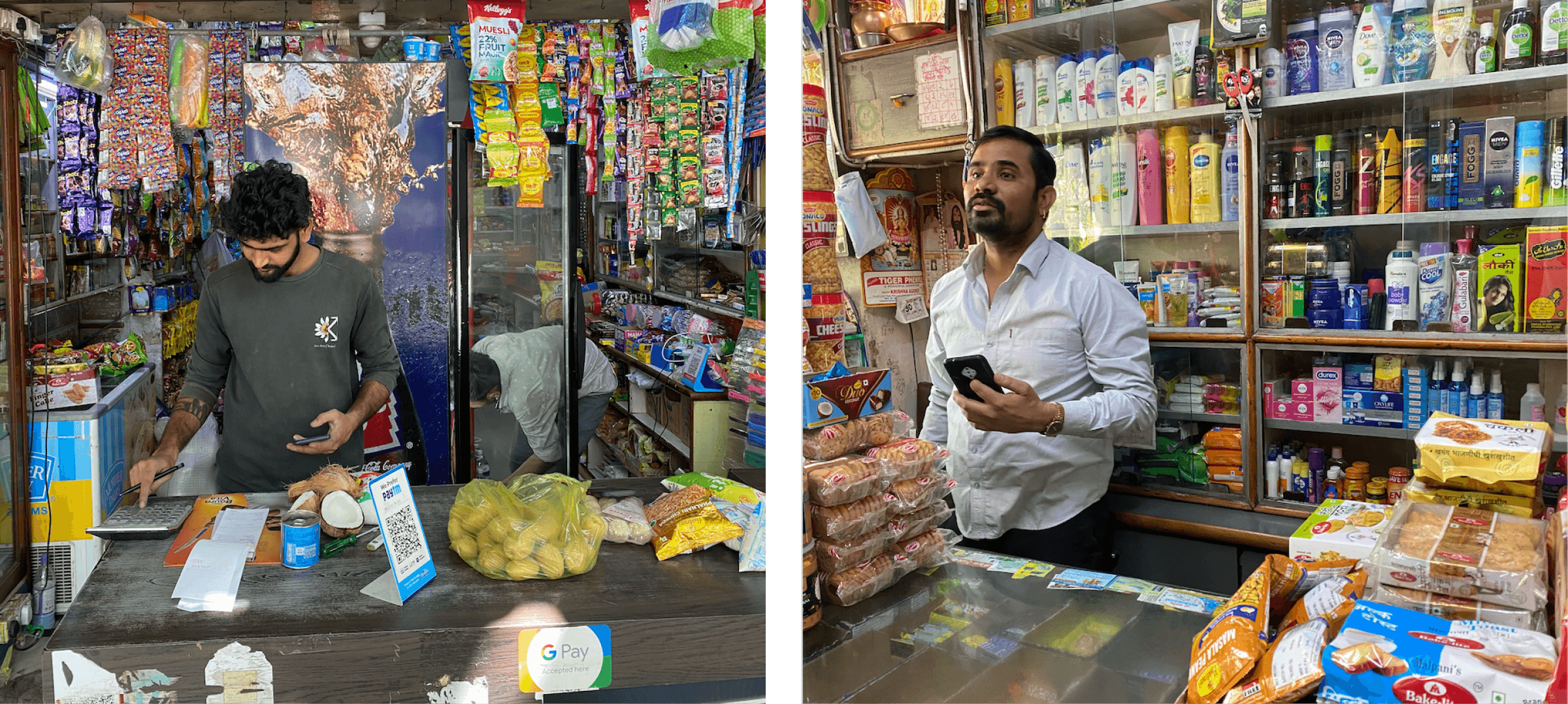
Kind(and consenting) research participants.
Uncovering the user experience
All that discovery led to some obvious and not so obvious realizations about the product and user flows that it needed to encompass for the optimal experience. To encourage collaboration, user flows were drawn up for the team to collectively understand the approach and iterate on them. This stage was helpful to further understand business requirements and to plan the product roadmap as per business priorities.
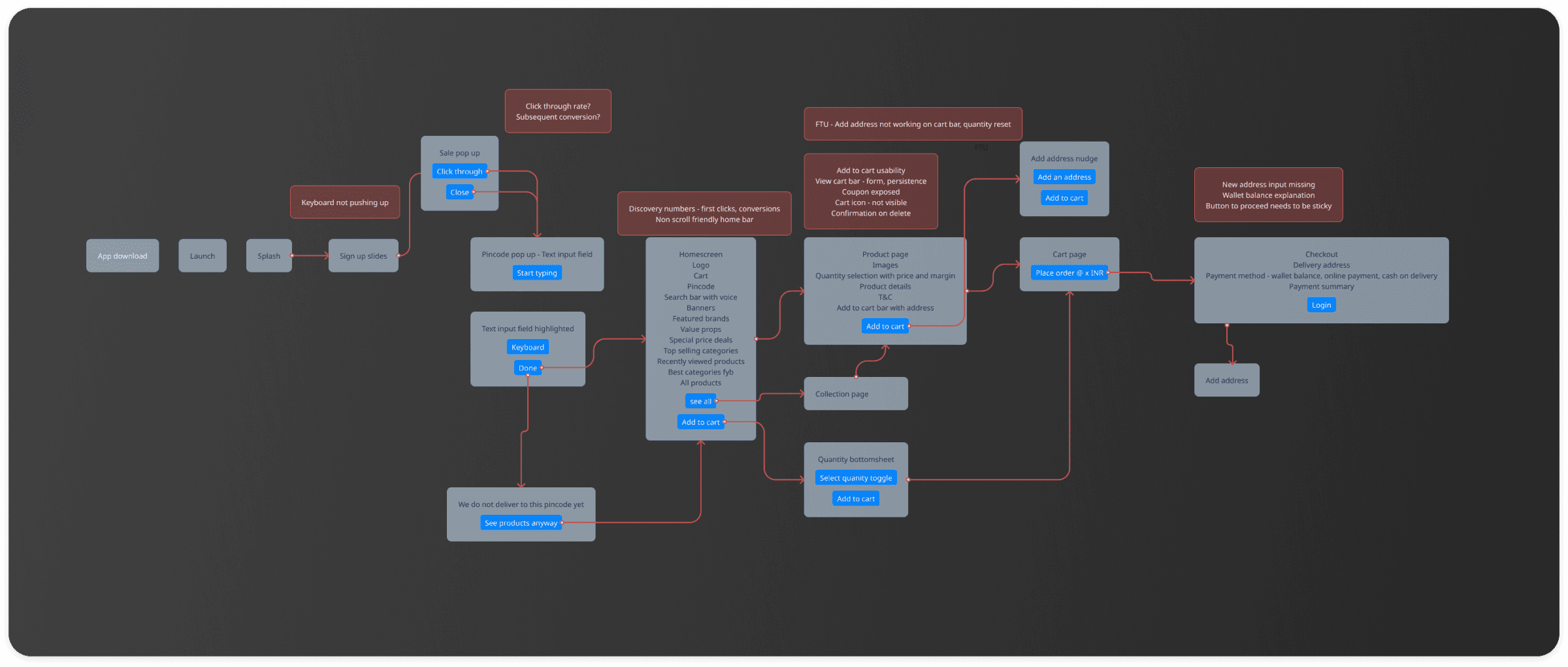
Once this exercise was complete, wireframes for prominent screens began to take form.
What does a wholesale app for kirana store owners look like?
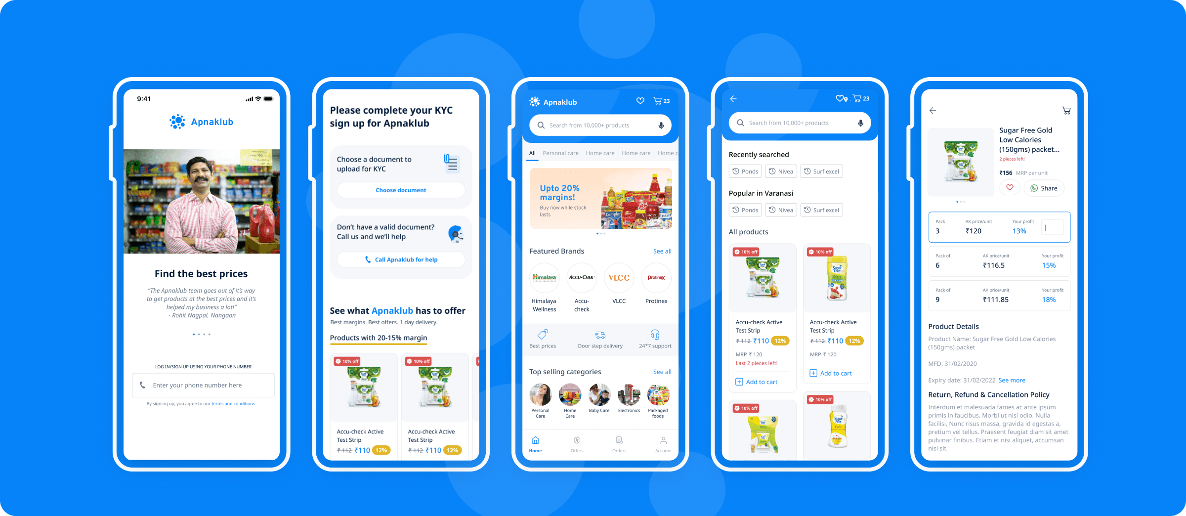
Some time bound visual exploration ensued to balance the needs of the business to remain professional whilst at the same time, limited the visual designs to a space wherein they remain accessible for store owners. Care was taken to not alienate store owners by making the look and feel of the app too premium. Research showed that such an interface is often associated with higher prices. At the same time, we also wanted to maintain continuity between the business’s existing branding and product without compromising on future potential. We landed on a simple and clean aesthetic that allowed for product imagery to show through whilst allowing for some minimal-yet-bold representation of the brand using their trademark Blue. Since the product was already information dense to begin with and only seemed to be heading further in that direction, using screen space efficiently also became a priority in the end result.
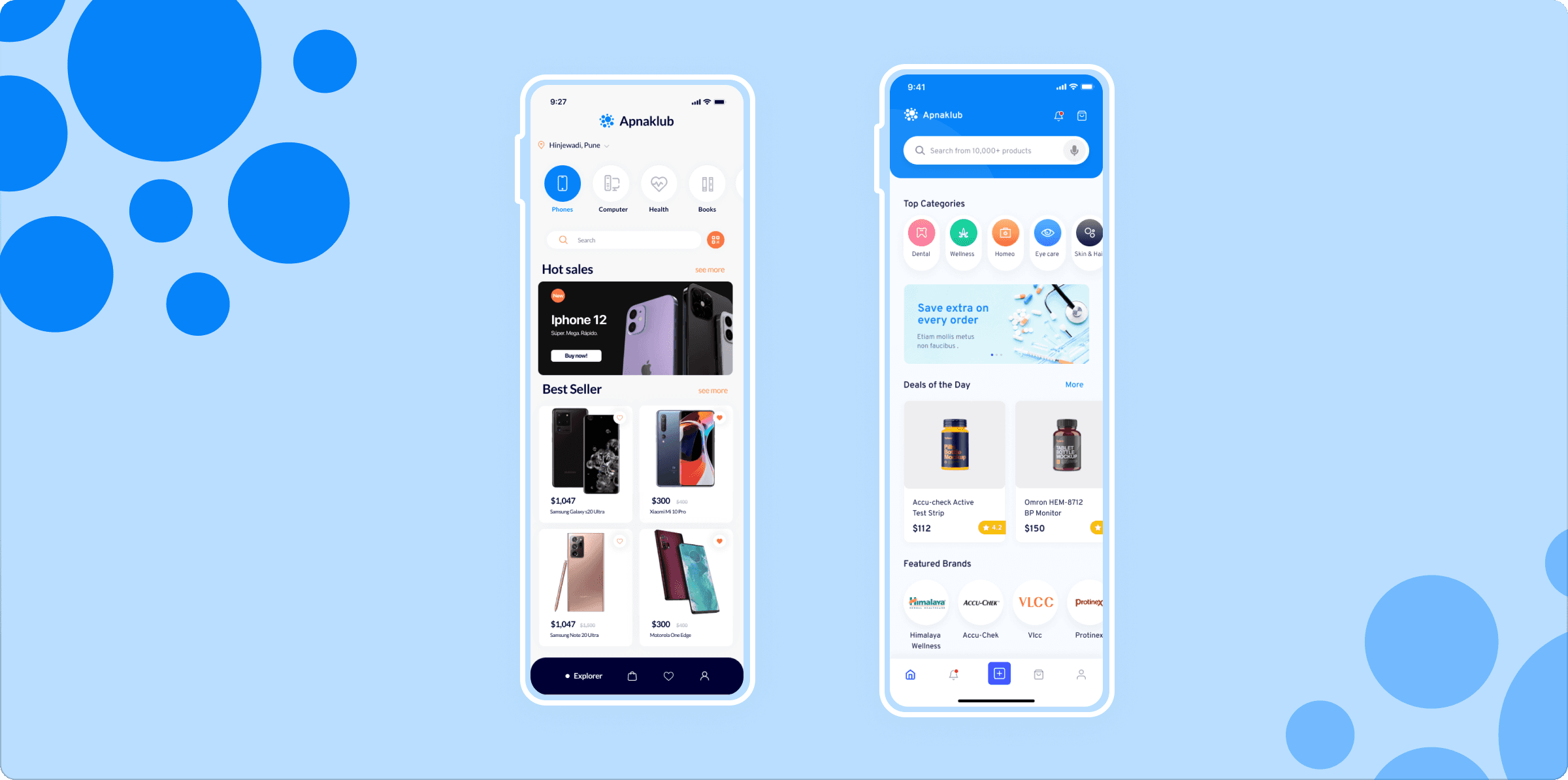
Delivering for now and designing for the future
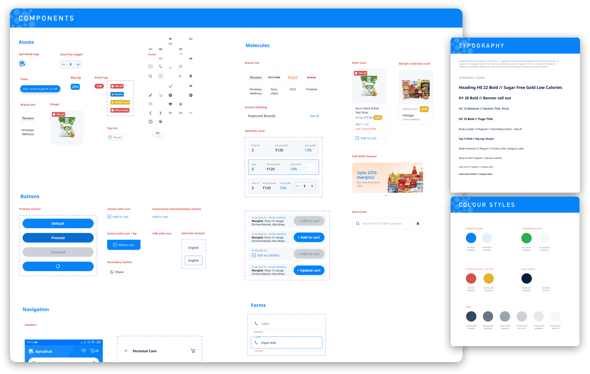
With these foundational steps completed, handoff cycles began in earnest. UI for the core screens and flows was completed first followed by secondary screens and flows. Along the way, a scalable design system was also created to help the development team at Apnaklub with future development and iteration. This design system was not comprehensive since the product was still in a nascent stage leaving room for further growth.
Testing for validation A/B
Once the development of the app was complete and a few months worth of data had been collected, the team at Apnaklub reached out for a follow up engagement. The focus in this one was to address problem areas in the funnel and iterate on core flows using A/B tests. Some of the critical flows that were tested were the onboarding — language selection, sign up & KYC; and the add to cart task flow for products. In the time since the first engagement, the team had grown significantly making the research in the first engagement critical to bringing everyone on the same page. The design system helped in achieving short turnaround times on UI which allowed us to iterate quickly.
The procurement problem
For kirana store owners, procurement continues to be an opaque process. Though current netwroks of supply are well established, they often have to deal with lack of transparency in pricing and delayed delivery timelines. On top of that, handling a brand’s distribution agent can often become an act in managing egos. This makes it hard for established businesses to operate efficiently and even harder for new entrants to create a foothold.
Apnaklub sought to solve this by giving kirana shop owners a platform where they could easily browse prices and place orders without the hassle of dealing with a brand’s distribution agent amongst addressing other inefficiencies.
Understanding the lay of the land
To begin with, the focus was to explore all the known and unknown aspects of this problem. Extensive conversations with the Apnaklub team helped me understand what they knew from their own on ground experience in this space. What followed was my own research into the business and their user base. Observing their day to day by sitting in their stores for extended periods of time, watching them interact with distributors and other competitors to navigate procurement and qualitative interviews gave me deep insights into their current experience. Multiple rounds of qualitative telephonic interviews were also conducted with kirana store owners across the country. An in-depth competitor analysis helped shed more light on the landscape.
This exercise culminated in a research document that informed product strategy and development well after a year of completion.

Kind(and consenting) research participants.
Uncovering the user experience
All that discovery led to some obvious and not so obvious realizations about the product and user flows that it needed to encompass for the optimal experience. To encourage collaboration, user flows were drawn up for the team to collectively understand the approach and iterate on them. This stage was helpful to further understand business requirements and to plan the product roadmap as per business priorities.

Once this exercise was complete, wireframes for prominent screens began to take form.
What does a wholesale app for kirana store owners look like?
Some time bound visual exploration ensued to balance the needs of the business to remain professional whilst at the same time, limited the visual designs to a space wherein they remain accessible for store owners. Care was taken to not alienate store owners by making the look and feel of the app too premium. Research showed that such an interface is often associated with higher prices. At the same time, we also wanted to maintain continuity between the business’s existing branding and product without compromising on future potential. We landed on a simple and clean aesthetic that allowed for product imagery to show through whilst allowing for some minimal-yet-bold representation of the brand using their trademark Blue. Since the product was already information dense to begin with and only seemed to be heading further in that direction, using screen space efficiently also became a priority in the end result.

Delivering for now and designing for the future
With these foundational steps completed, handoff cycles began in earnest. UI for the core screens and flows was completed first followed by secondary screens and flows. Along the way, a scalable design system was also created to help the development team at Apnaklub with future development and iteration. This design system was not comprehensive since the product was still in a nascent stage leaving room for further growth.

Testing for validation A/B
Once the development of the app was complete and a few months worth of data had been collected, the team at Apnaklub reached out for a follow up engagement. The focus in this one was to address problem areas in the funnel and iterate on core flows using A/B tests. Some of the critical flows that were tested were the onboarding — language selection, sign up & KYC; and the add to cart task flow for products. In the time since the first engagement, the team had grown significantly making the research in the first engagement critical to bringing everyone on the same page. The design system helped in achieving short turnaround times on UI which allowed us to iterate quickly.
